Case Study: Intranet Redesign

Reimagining employee connections on a global scale

Overview

Redesigned and rearchitected internal people site used daily by over 400,000 employees globally to help them forge more meaningful connections, faster.

Who this was for

  • Users: Over 400,000 employees of a massive multinational consulting company in over 50 countries, at all levels of seniority.
  • Client: CIO and other company stakeholders

Obstacles & Opportunities

Scope adjustment • Project plan did not consider complexity of information environment or the context within its ecosystem. We discussed with the client and adjusted it. • Many primary personas • Extremely diverse, global user base with differing needs meant choosing research and testing participants wisely • Limited research • Limited body of information on user needs and behavior necessitated additional research • High team turnover • Risks associated with knowledge transfer

My role

UX design, research, and information architecture.

Team

  • Project manager (1)
  • UX designer (2)
  • Visual designer (1)

Skills I used

Content strategy • Designed and conducted content audit • User research • Designed and wrote research study • Defined recruiting criteria • Designed and wrote screeners • Conducted interviews • Synthesized research • Created and moderated open card sort • Information architecture • Taxonomy • Wireframes • User flows • Interaction design • Usability testing

Tools I used

Paper, Pencil, and Brain • Printer & Scissors • Omnigraffle • Invision • Adobe Illustrator • Photoshop • InDesign • Excel • PowerPoint • SurveyMonkey • Adobe Cloud Library
CONTEXT

Something had to be done.

Once upon a time...in a land that may or may not be far away...

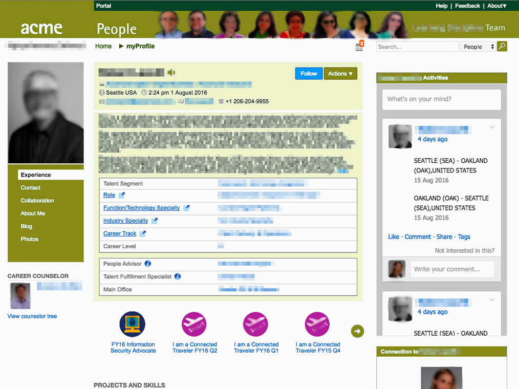
  • There was a great consulting company that had an internal people site for employees to find and connect to each other.
  • It grew so huge and so diverse that its infrastructure could no longer support the amount of information employees needed to connect and do work. Around the world, thumbs twiddled and frustrated voices sighed with long page load times and well-hidden information.
  • With thousands of employees needing to use the site daily but reaching a bottleneck, something had to be done.
  • So the company hired us--Fjord Seattle--to get the site working for its employees once more.

Story

And then what happened?!

Research

We interviewed employees of different roles and levels all over the world to determine their needs

  • We started with existing research done by Fjord teams working before us on connected sites within the same ecosystem. This included a set of personas.
  • I evaluated what information we still needed
  • We performed additional research (related mostly to behaviors and attitudes around this portion of the employee ecosystem)
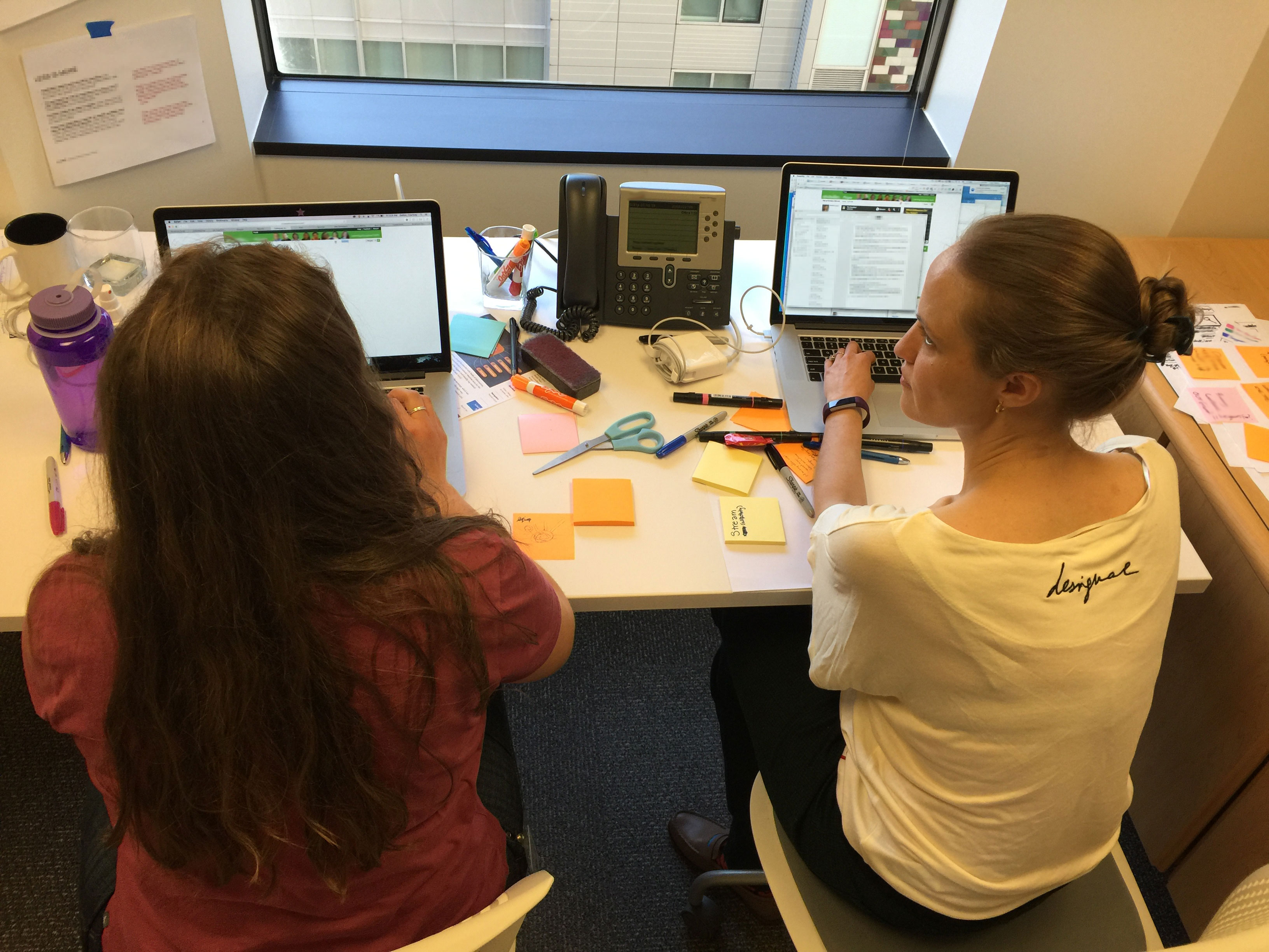
  • I conducted a guerrilla card sort to inform the information architecture of the site, as it was sorely needed, but not scoped.

IA and wires

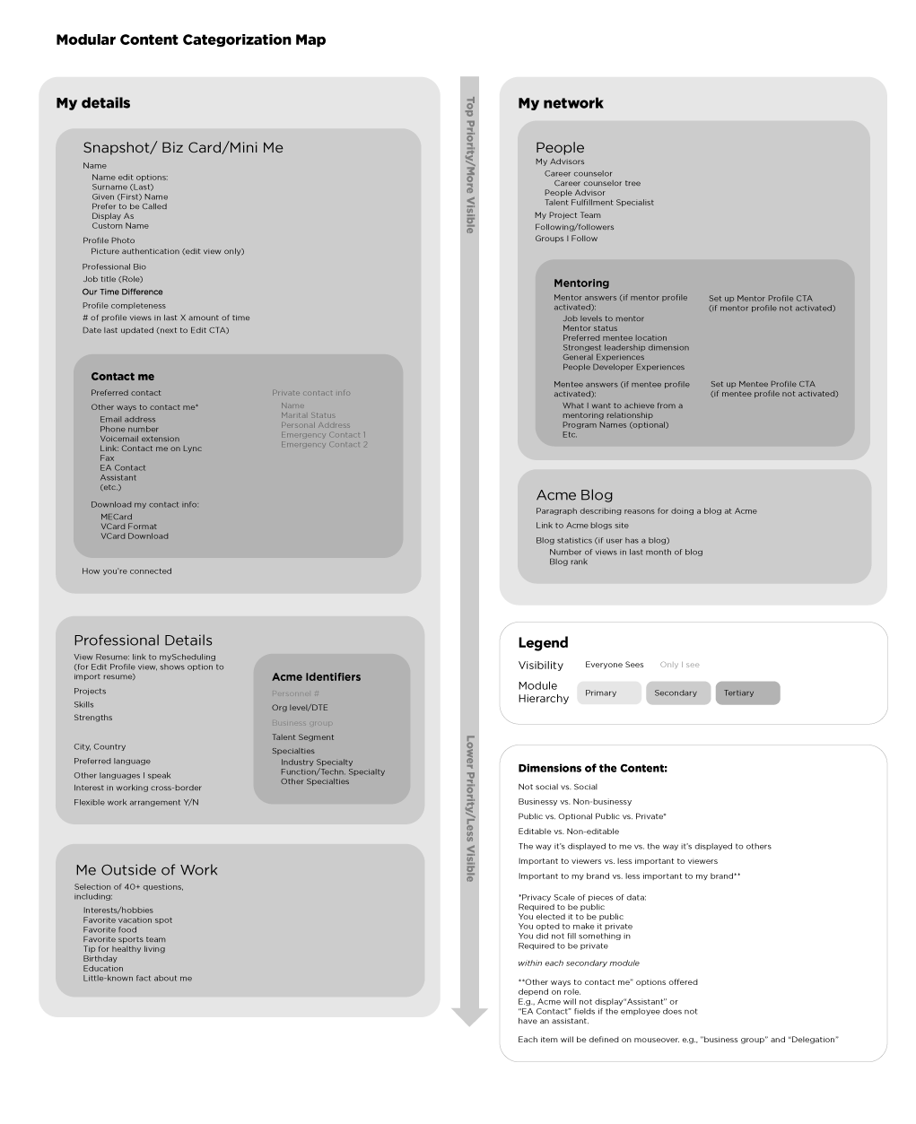
We audited the content of the site, consulted our personas and research, and created a framework within which human connections could thrive.

  • Content audit of:
    • The existing people site
    • Other sites in employee ecosystem that connected to or shared functionality with the people site. (There was a lot of this, and it hadn't been mapped yet.)
  • Content strategy
  • Taxonomy
  • Designed search system and experience. Recommended facets for search and designed search
  • Sitemap
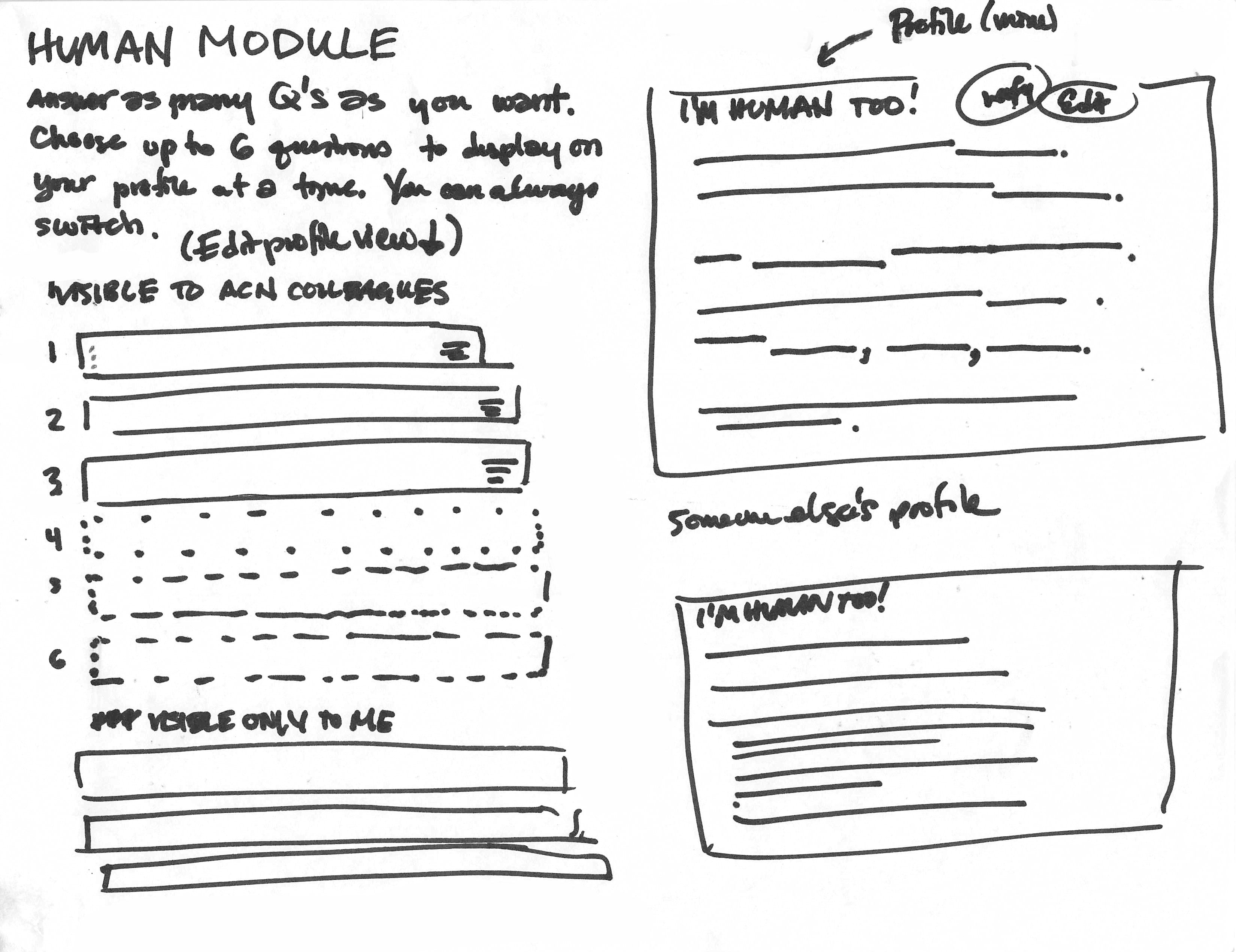
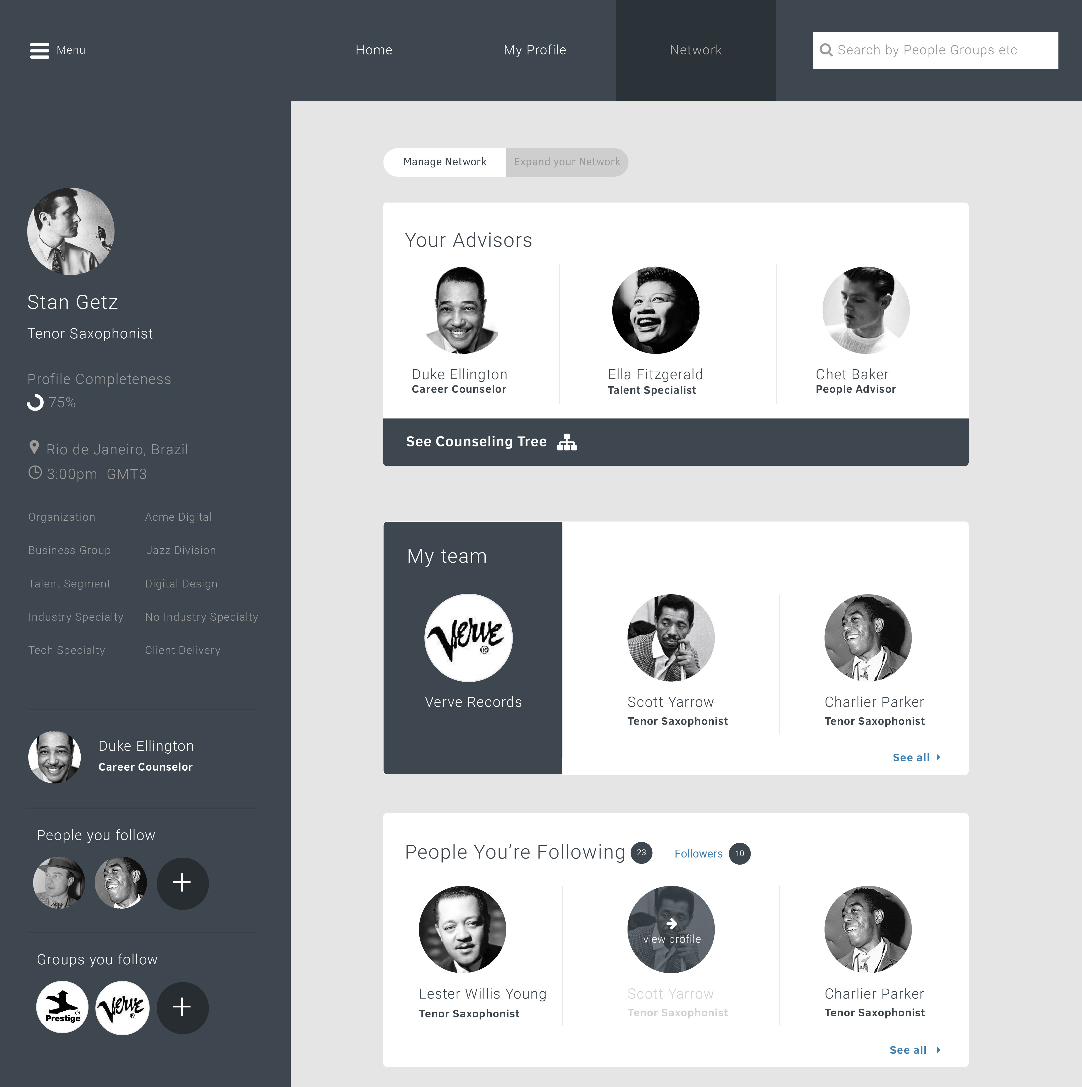
  • Wireframes

Design system

I set the wireframes up in a modular framework so that the design could be done in a more agile, modular process throughout the project, all the way to visual design and beyond.

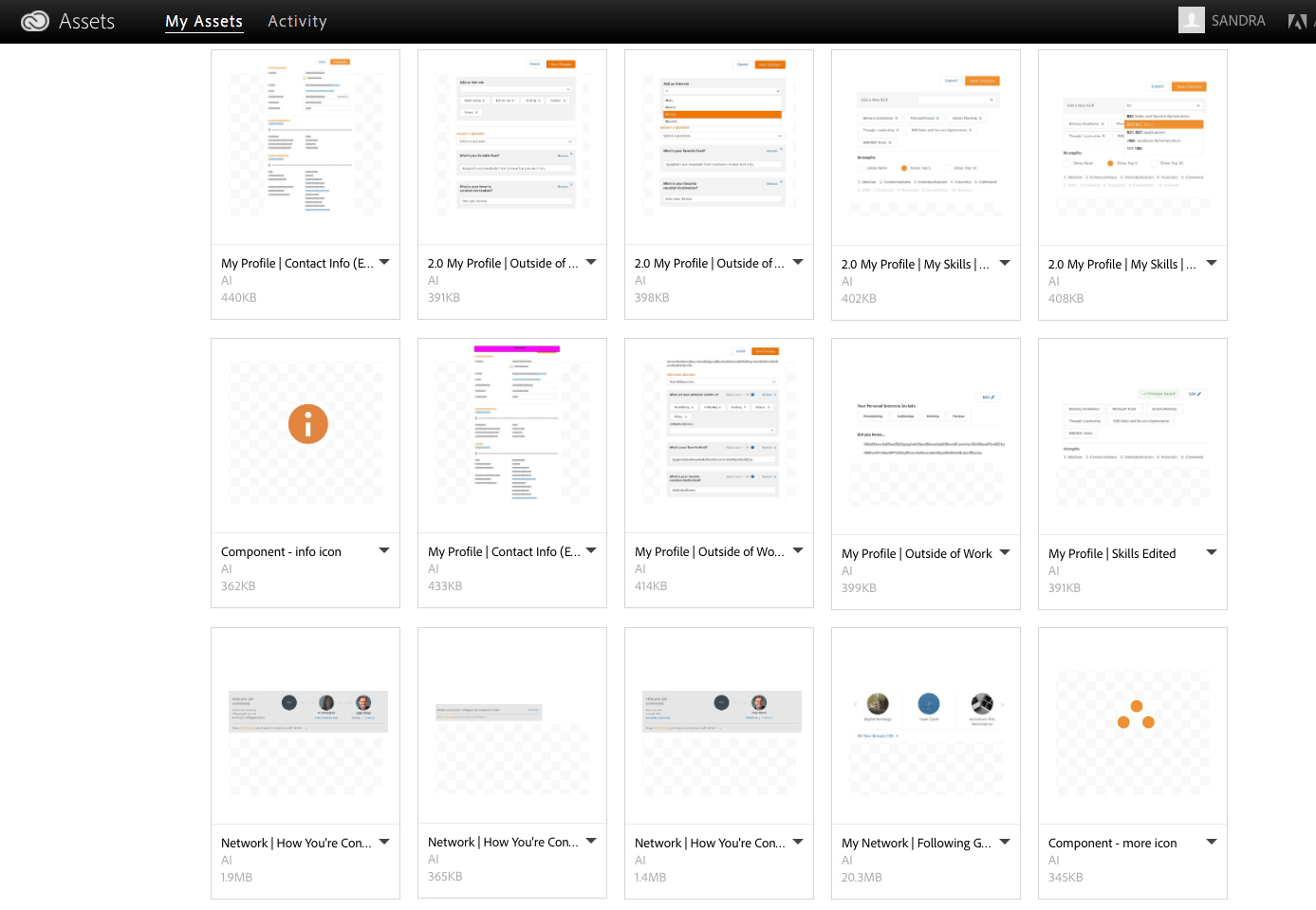
The visual designer and I strategized and set up a speedy process using Adobe Cloud library where I uploaded wireframes of modules, then she transformed them into visual designs.

Prototype

We took input from the client in a workshop, which helped contribute to a beautiful prototype.

  • Interactive prototype using Invision
  • Ran usability testing with prototype to validate hypotheses.

Usability testing

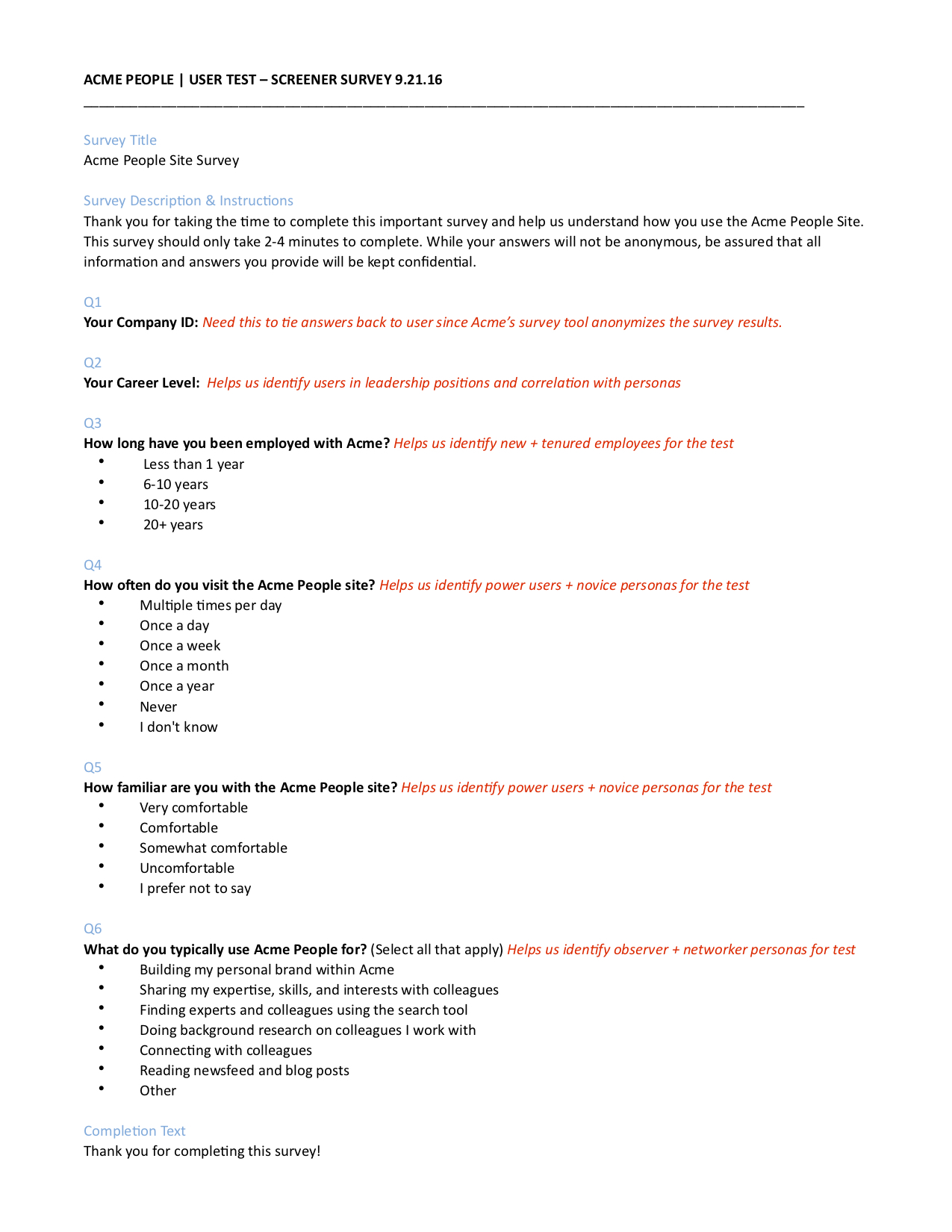
We tested the prototype with employees, using mostly remote moderated testing. My contributions included:

  • designing the usability study and test questions
  • writing the screener
  • acting as one of two moderators for the usability tests
  • synthesizing test results with one other colleague
  • defining recruiting criteria to align with primary personas
  • alongside colleagues, iterating on design after receiving feedback from test results

What next?

The design went to development.

Because we did not have access to developers on this project, we ensured that the specs were laid out precisely and with clear documentation. As a result, when the site went live, we found that it functioned exactly as specified.

Results

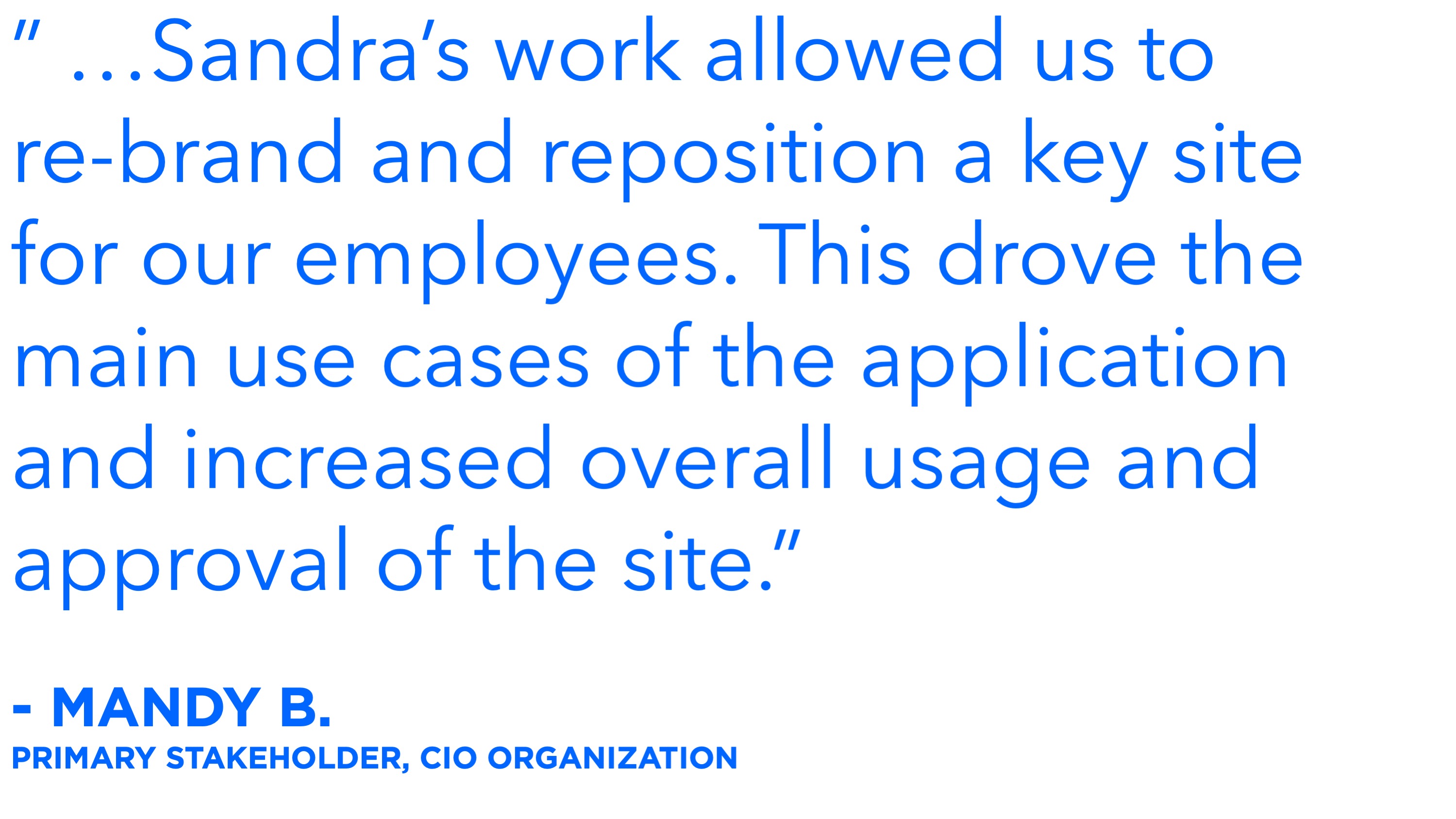
Finally, in mid-2017, the site went live! Ever since then, employees have been able to find what--and who--they need faster and more easily.

The site has been live ever since then and has received consistently high praise throughout the organization.

See another project

< Previous: Design Method Workshops Next: Customer Service Design >

Contact me

© Sandra Lloyd 2018